A one-person home goods shop lists a ceramic mug set at a price that undercuts its two closest competitors by a third. Click-through from the feed sits near one percent for six weeks. The seller assumes the price is wrong, then the title, then the category. The actual problem is upstream of all three: the main image answers “what is this” when the feed is asking “why would I stop scrolling.”
The TikTok Shop main image is read in a square crop, on a phone, at arm’s length, next to a video that is already moving. It is not a catalogue photo and it is not a product page hero. It is a thumbnail with roughly one second to earn a tap, and the same file then has to survive being opened.
This is written for the solo seller or two-person team running home goods in the US with fewer than ten people, where one listing image decides whether a month of traffic is worth paying for. It covers what the crop does to a photo, what the thumbnail has to answer, and how to test a replacement without burning a week of impressions.
Why the feed never shows your main image as you shot it
The upload is usually a 3:4 or 9:16 studio frame with the product centred and a lot of air around it. The feed slot is square. Whatever sits at the edges of your frame is gone before anyone sees it, and if the product is small in frame, the crop does not just trim — it enlarges empty space.
Two consequences follow, and both are visible in the first second. First, the product has to survive the centre square: if the mug set sits low and left, the thumbnail shows the table it was standing on. Second, contrast has to live inside that square, because the feed background is bright and moving. A pale product on a pale surface, shot beautifully, reads as a grey card next to a video with a face in it.
| What the thumbnail shows | What the feed reads it as | What to change |
|---|---|---|
| Product small in a styled scene | A stock photo, or a category, not an offer | Push the product to fill two thirds of the square |
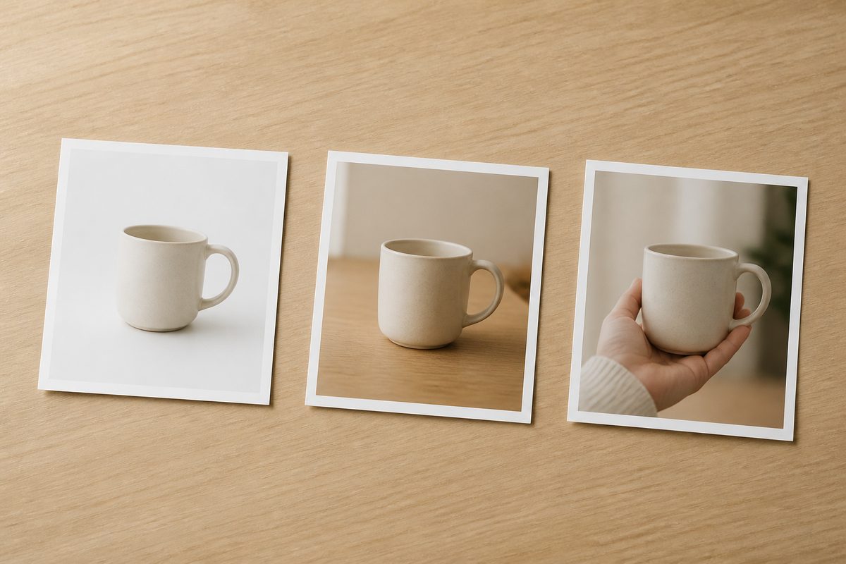
| Product on white, nothing else | Cheap, or a placeholder that failed to load | Add one adjacent object for scale and one surface for context |
| Text overlay covering the product | A discount banner, so the price is assumed low | Move the claim off the image and into the first line of the title |
| Price in the corner | The only thing that gets read | Show the use case instead; the price renders below anyway |
The fourth row is the one sellers fight about. The platform already prints the price under the thumbnail. Painting it into the image duplicates a number the viewer gets anyway, and spends the most valuable pixels in the slot on information that was free.
What the thumbnail has to answer, in order
Three questions get asked before a tap, and they are asked in sequence, not at once. What is it. Is it for someone like me. Is it worth opening.
The first is a legibility test. If a viewer cannot name the object in under a second, the image has failed regardless of how good it looks. Home goods are unusually exposed here, because a candle holder, a soap dish and a small vase photograph almost identically at thumbnail size. Scale is the discriminator: a hand, a book, a mug, anything with a known size, fixes the ambiguity instantly.
The second is an audience test, and it is the one sellers skip. A cream ceramic mug on a marble counter says “gift shop”. The same mug on a crowded desk with a laptop says “office”. Same product, same price, different buyer. Picking the scene is picking the customer, and it is a decision, not decoration.
The third is a value test that the image can only hint at. It cannot state a price, but it can show quantity, size, or a finished result. A set of four mugs reads as more than a set of one at the same thumbnail size, and that difference is doing conversion work before anybody reads a word.
Testing a replacement without wasting a week
The mistake is changing the image and the title and the price in the same week. When click-through moves, nobody knows which change moved it. Change one file, keep everything else fixed, and give it enough impressions to mean something.
For a single listing, that usually means five to seven days. Below roughly a thousand impressions the result is noise; one strong day can double a percentage that means nothing. If traffic is thin, run the comparison against your own two best-selling listings — you are looking for “does this image beat that image”, not “is this image good”.
Read click-through first, and only then the product page. An image that lifts taps and drops add-to-cart has not failed, it has attracted a different viewer, and the fix is usually the first screen of the product page rather than the thumbnail. The add-to-cart diagnosis covers what happens after the tap lands; this section is only about earning it.
One limit is worth keeping: a thumbnail that over-promises converts worse in the end, because the product page cannot deliver a scene the product does not belong in.
DAMI’s image generation covers the production side: a product shot can be turned into several listing-ready variants with different backgrounds and crops, which makes a five-variant test possible in a day rather than a month of reshoots. The variants still have to be judged by click-through — the tool produces options, it does not pick the winner. Used that way it removes the excuse that testing is too slow, which is the actual reason most sellers never test. If tooling is what stopped you, opening a DAMI account takes minutes.
Where the main image stops mattering
The first ceiling is a category where everyone shoots the same way. When nine of the ten results on a search page show the product on white at the same three-quarter angle, the buyer has stopped reading images and started reading price. A better crop buys a small edge and no more; the honest move is to accept parity and compete on something the shelf cannot match.
The other ceiling is motion doing the selling. In a feed placement a video is already running beside the thumbnail, and a still does not win the same second of attention as a moving face. When traffic is video-led, the main image is doing search-result duty and should be optimised for legibility at small size. DAMI’s video creation covers that other side, so the split between still and clip becomes a decision rather than an accident.
A stop condition helps. Three variants over six weeks with no movement in revenue per thousand impressions is no longer a creative problem. DAMI’s product performance view reports revenue after refunds, tax and shipping per SKU, which decides whether a fourth variant is worth the week.
FAQ
Should the main image include a person?
Only if the person is using the product or fixing its scale. A model holding a mug for no reason adds a face and subtracts clarity, and faces in thumbnails compete with the video next to them.
How much text can go on the image?
Assume none is read. A claim that matters belongs in the title’s first four words, where the feed renders it as text rather than as pixels that get cropped.
Does a better main image change my ranking?
Not directly. It changes click-through, and click-through changes how much traffic the listing earns from the same impressions. The ranking effect is a consequence, and it takes weeks, not days.
Crop the current photo to the centre square and look at it on a phone at arm’s length. If you cannot name the product and the buyer from that crop alone, the image is the problem and no title work will fix it. The gap between creator traffic and product page conversion explains what happens after the tap; the DAMI workspace is where the listing variants and the product data sit next to each other, so the comparison is against your own numbers rather than against a competitor’s screenshot.